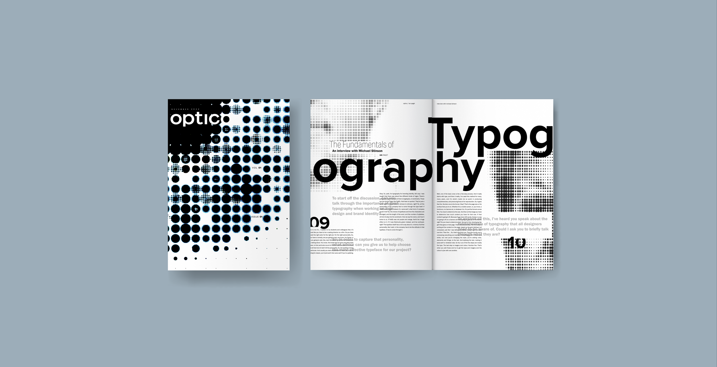
OPTICO
Publication Design/ Typography/ Adobe InDesign, Adobe Photoshop, Adobe Illustrator
To apply typographic theories & principles to create a magazine design system and explore typography through identity development. Considering form, structure, & style, creating a wordmark for a magazine that communicates meaning & begins to build a visual language. The goal of this process was to create a concept statement for the publication, then to create a word mark to represent that concept.
Optico is a science and technology magazine that focuses on the science of legibility and readability in typography.
01. CREATING A TYPOGRAPHIC WORDMARK
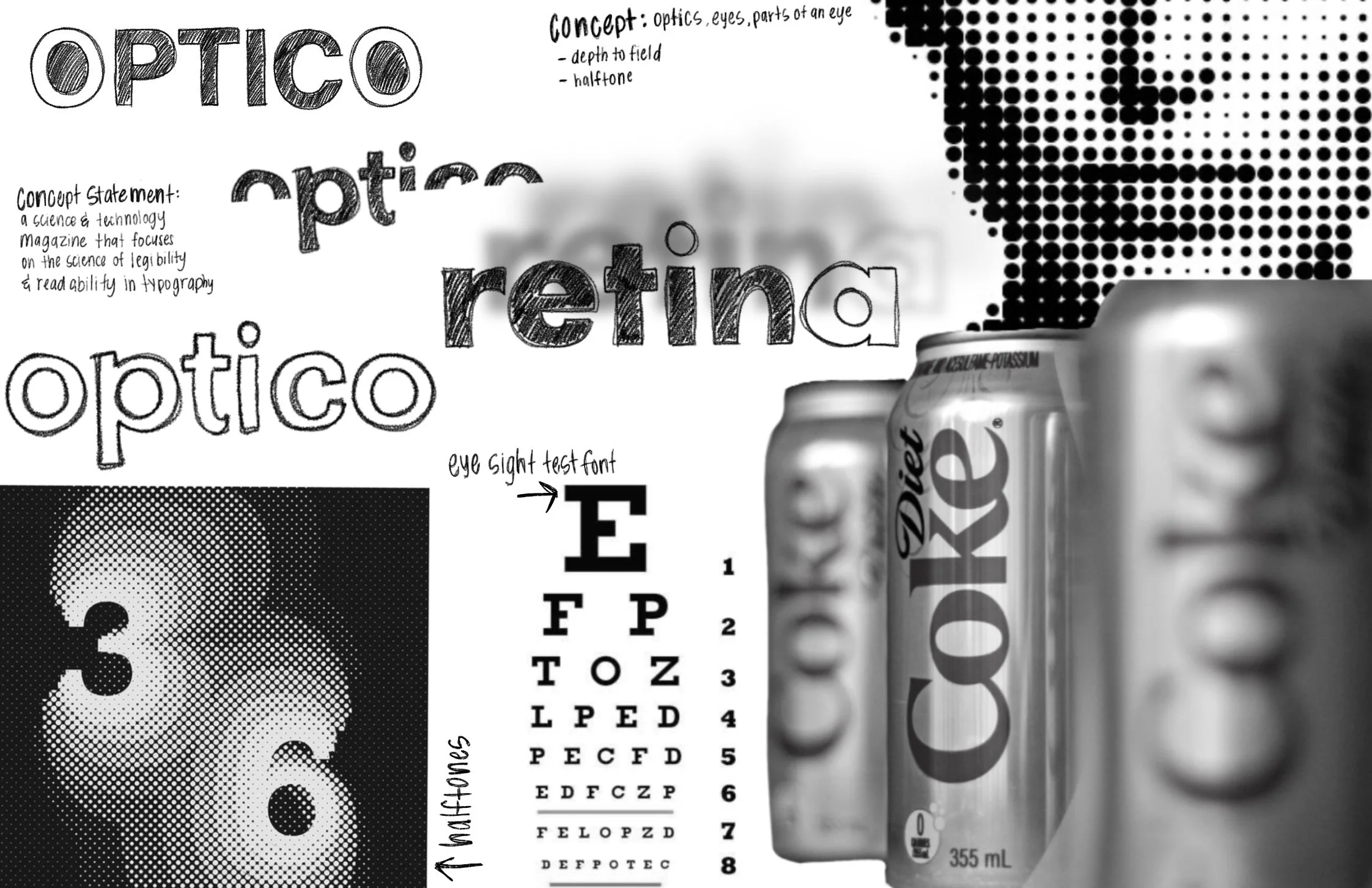
Exploration of many different sans-serif typefaces to effectively portray the concept statement, and the design and typographic attributes.
EXPLORATION
ITERATIONS
After focusing on my typeface I made minor changes to fit my own design attributes.
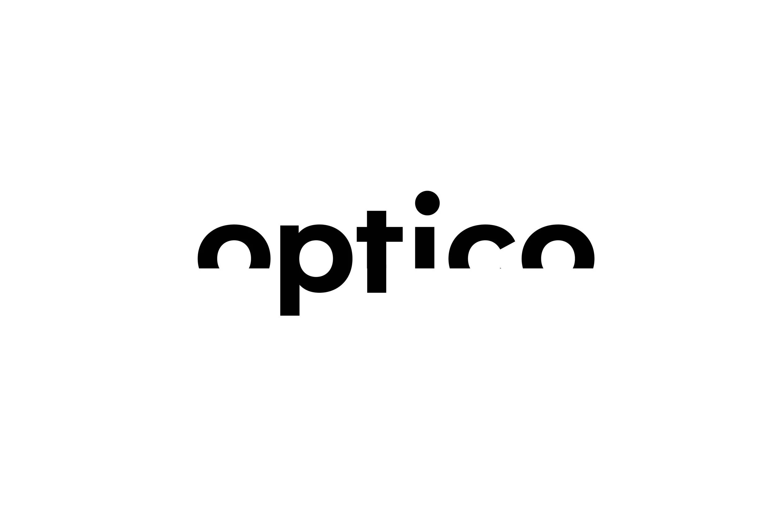
FINAL WORDMARK
The font I chose was Semi-Bold Monsterrat. I felt it portrayed a strong and symmetrical structure.
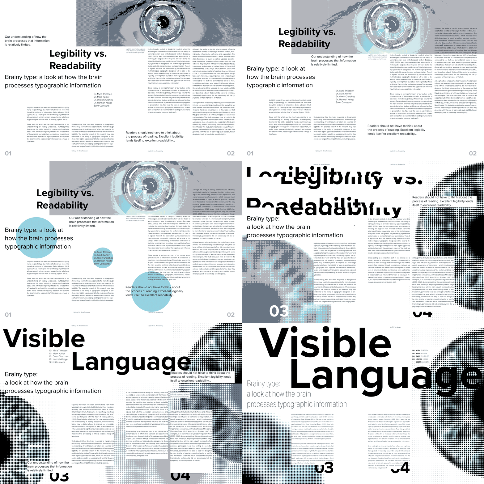
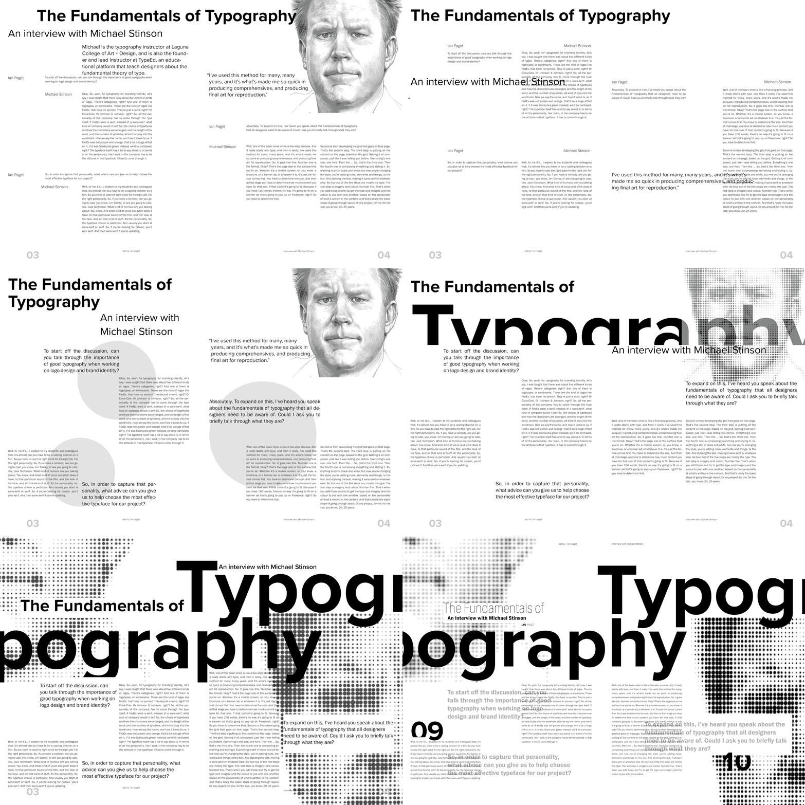
02. DEVELOPING A COMPOSITION
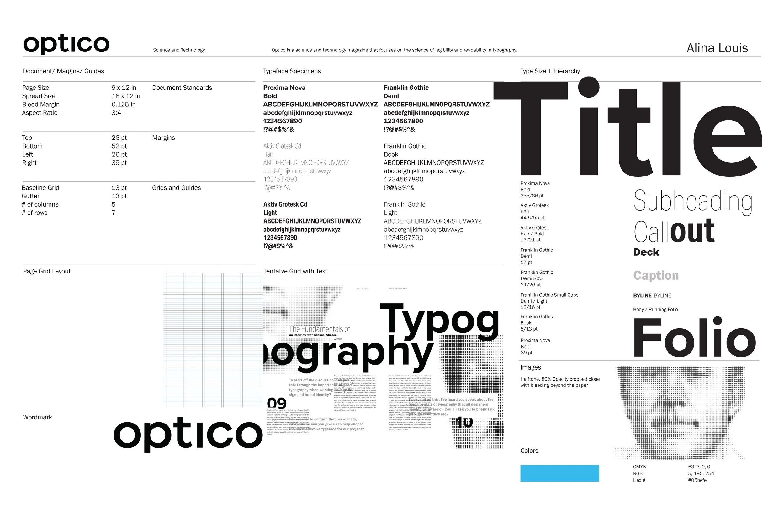
Creating guides to follow when constructing the final publication spreads.
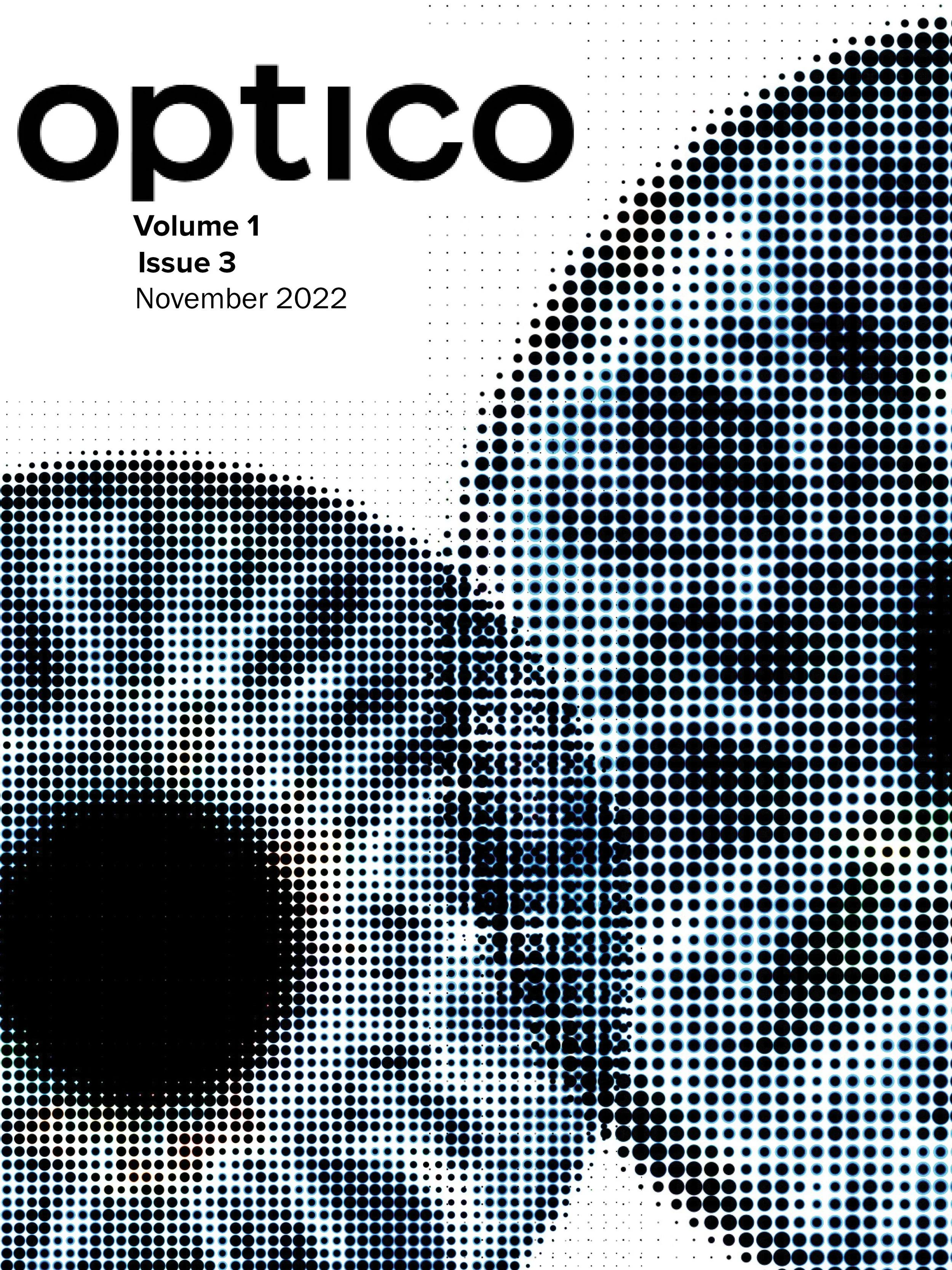
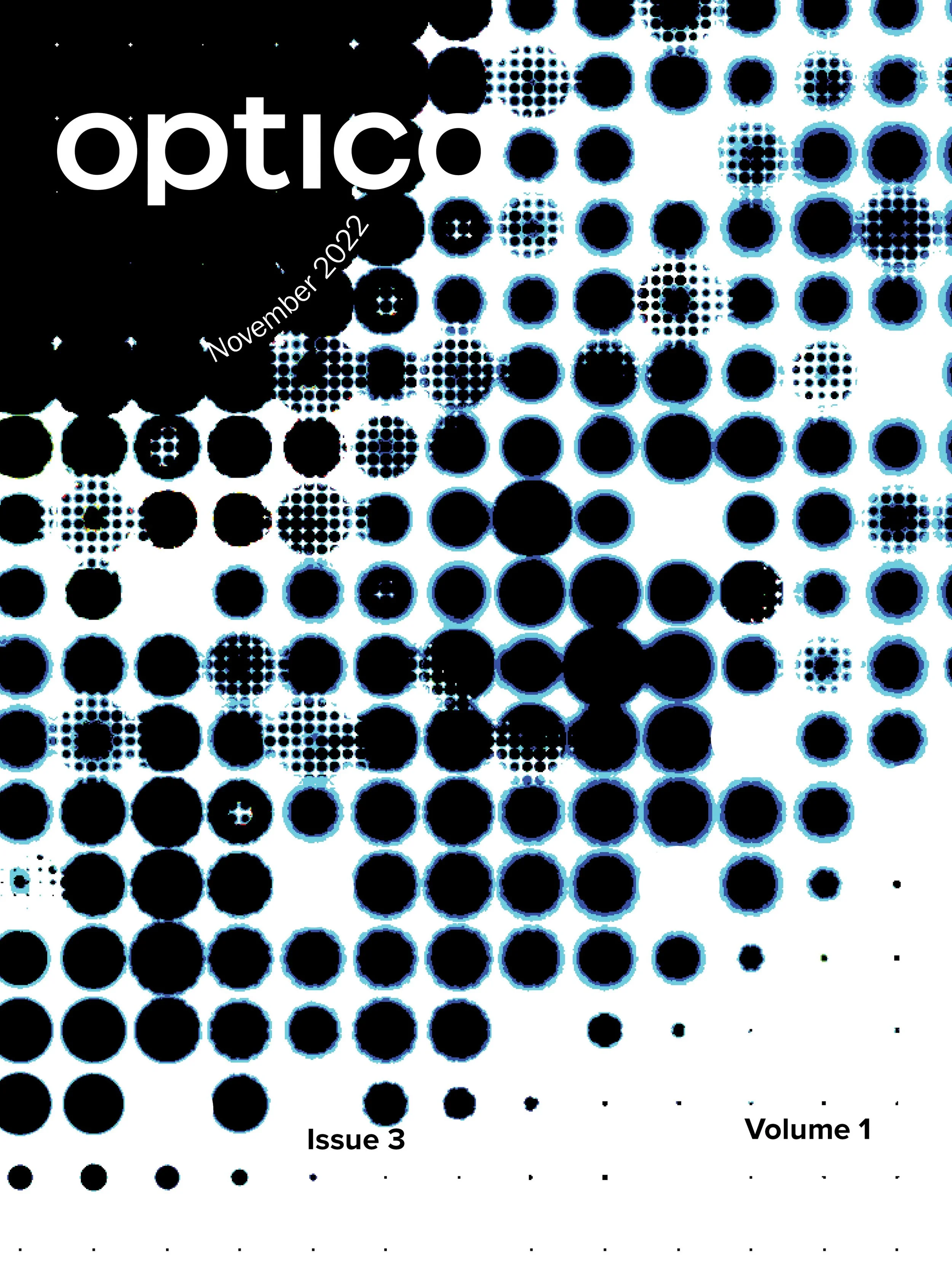
CREATING A VISUAL IMAGE
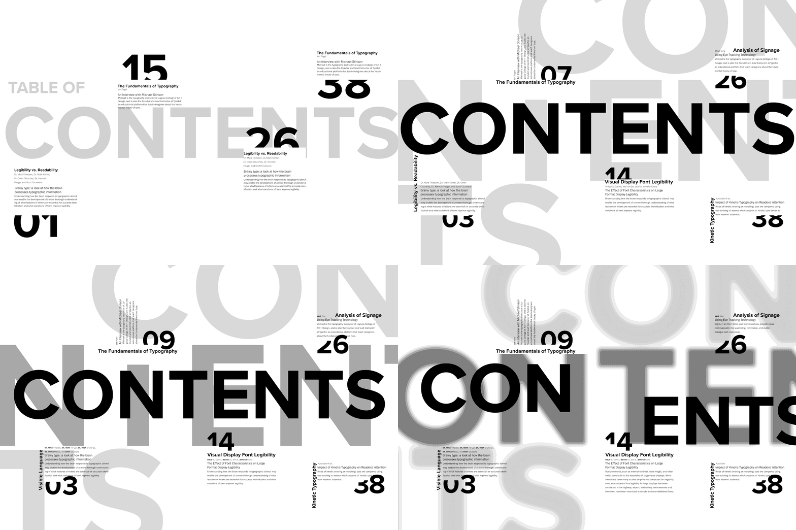
After developing initial spread sketches, tasked with developing a cover page that also flowed with the concept.
